‘21-’25
Apple
One
‘21-’22
Apple One is a subscription bundle that features up to six services. The best of Apple. All in one.
Art direction, and design lead for Apple One launch campaign in the US, UK, and Japan market. Collaborated with creative, design, motion, and multiple cross-functional teams including Business Affairs, and Legal for asset clearance, and usage rights.
Worked on the visual identity, design system, motion language, and brand guidelines for Apple One. Sourced assets from six different services which included Apple TV+, Apple Music, Apple Arcade, Apple Fitness+, Apple News+, and iCloud+.
Fig. 01 — WIP, Work in process. This is a condensed look at the overall workflow, sketches, design thinking, and process. Through numerous iterations, the visual language was refined to be simple, and easy to understand.
![]()
![]()
![]()
![]()
![]()
![]()
![]()
![]()
![]()
![]()
![]()
We started with just a basic understanding of what Apple One encompassed as a service. We wondered how it was enriching the lives of our customers. We knew it was a great way to access the best of Apple, in one easy to buy bundle. The challenge was to communicate the bundles into something that’s simple to understand. And because this subscription accompanied many different services, it meant we had to look at a massive array of assets, and imagery that we could leverage in both static and motion.
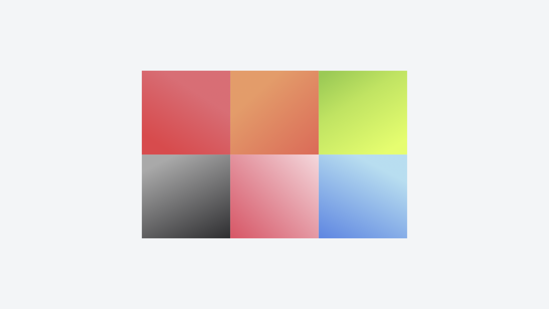
We experimented with layouts that categorized the services into bento boxes. The design process led us to even simpler solutions with type—only layouts. We looked at the brand colors of each service. And with those colors, we experimented with the Apple logo. And wondered how it could be divided into different sections that represented the services.
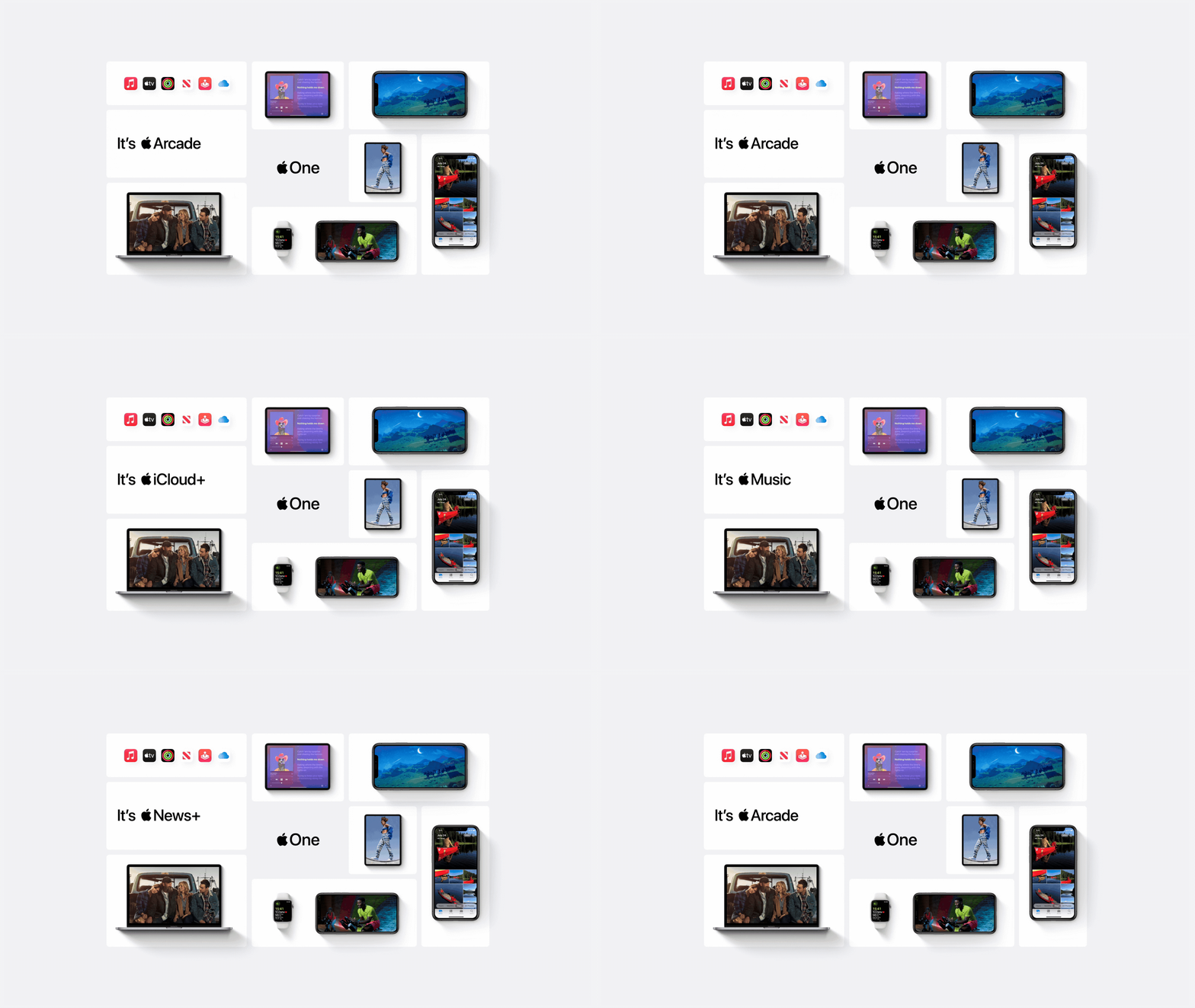
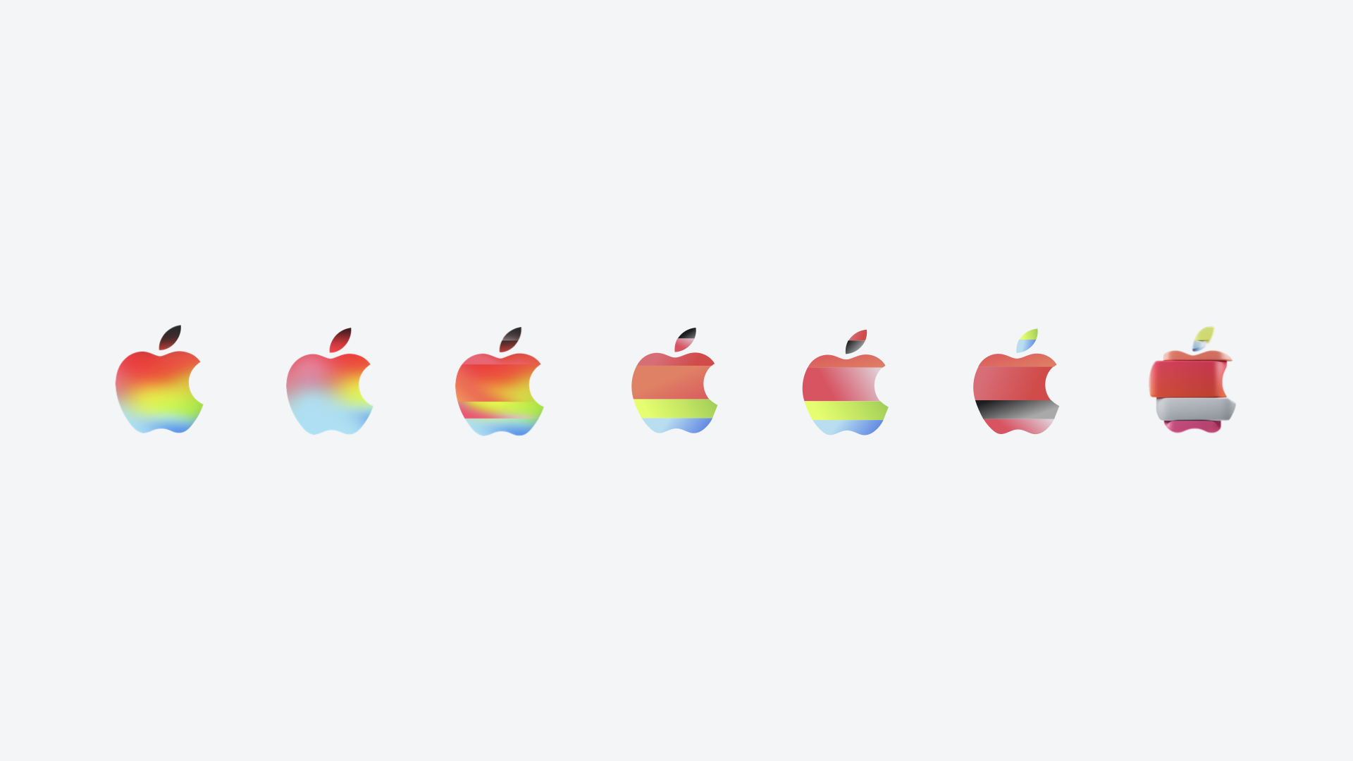
We eventually landed with something that felt truly simple with a hint of materiality to represent Apple One.
Fig. 02 — Apple One Mnemonic Logo US & UK. Fig. 03 — Apple One Mnemonic Logo Japan. Final 3D logo and mnemonic work by ManvsMachine. The materiality was meant to be a reflection of the service app icons.

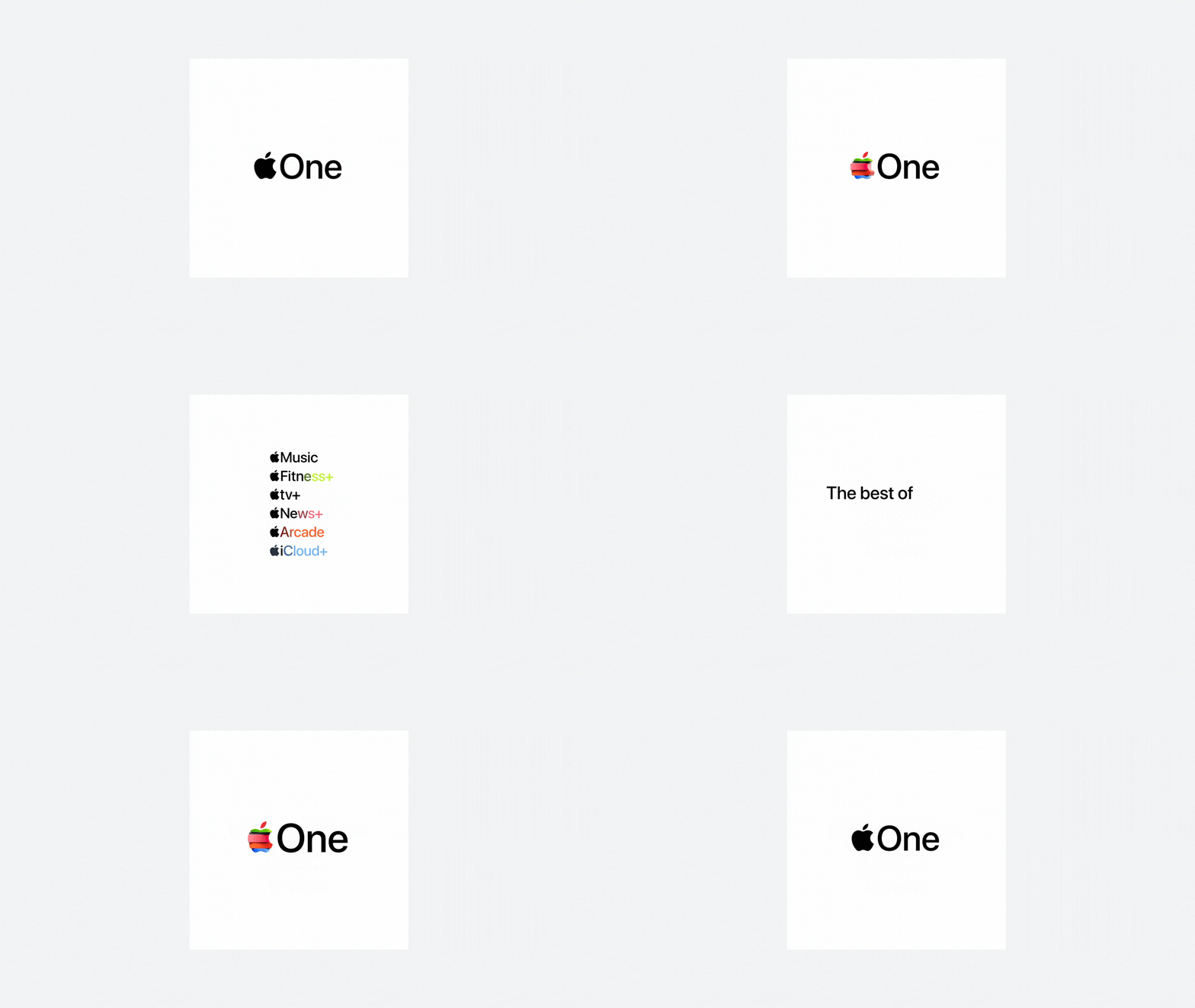
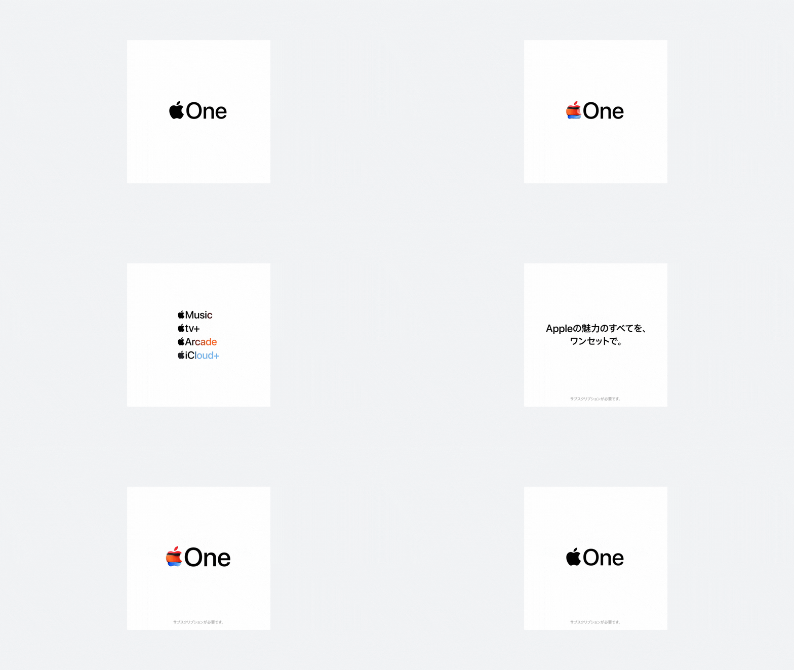

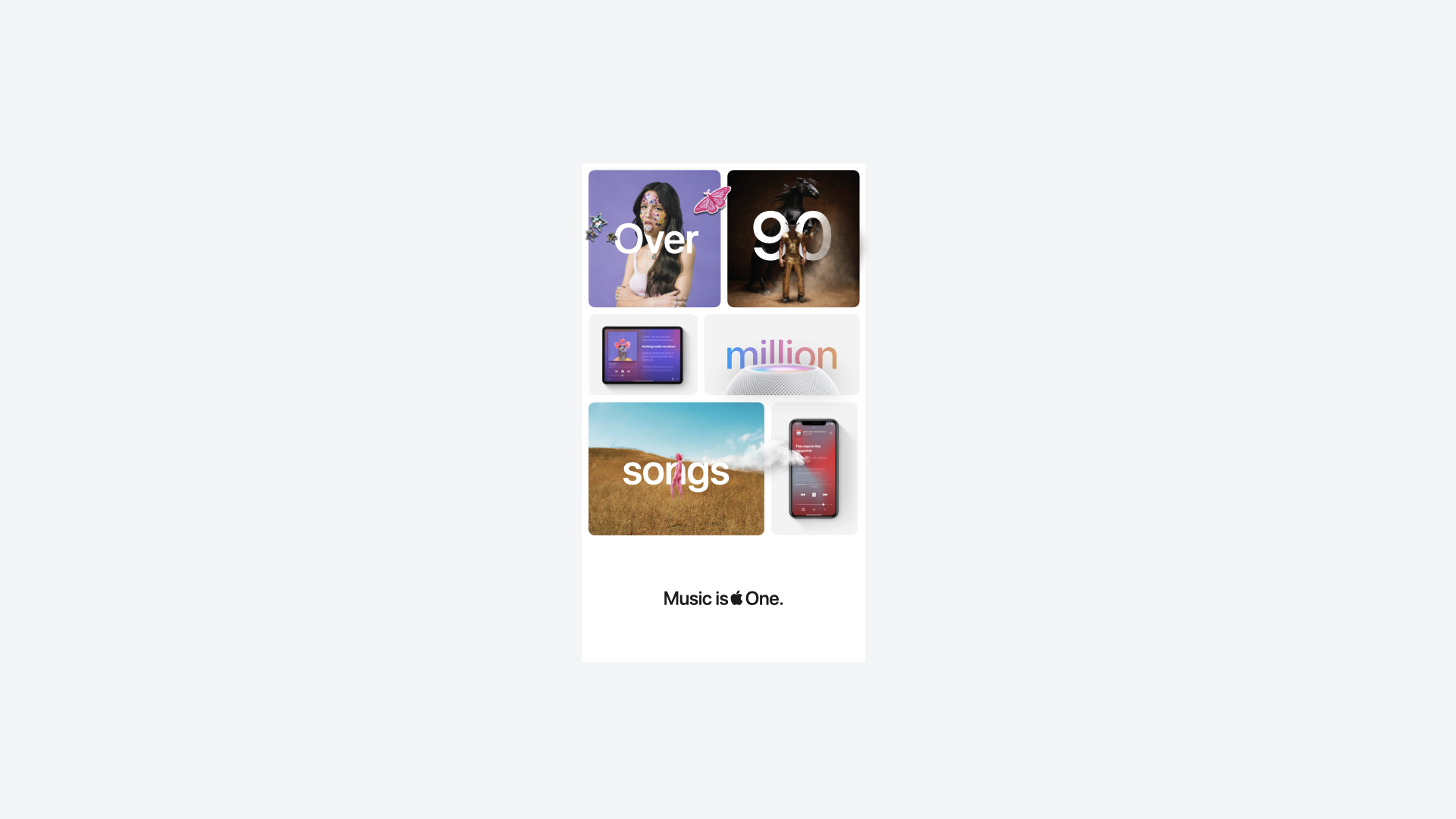
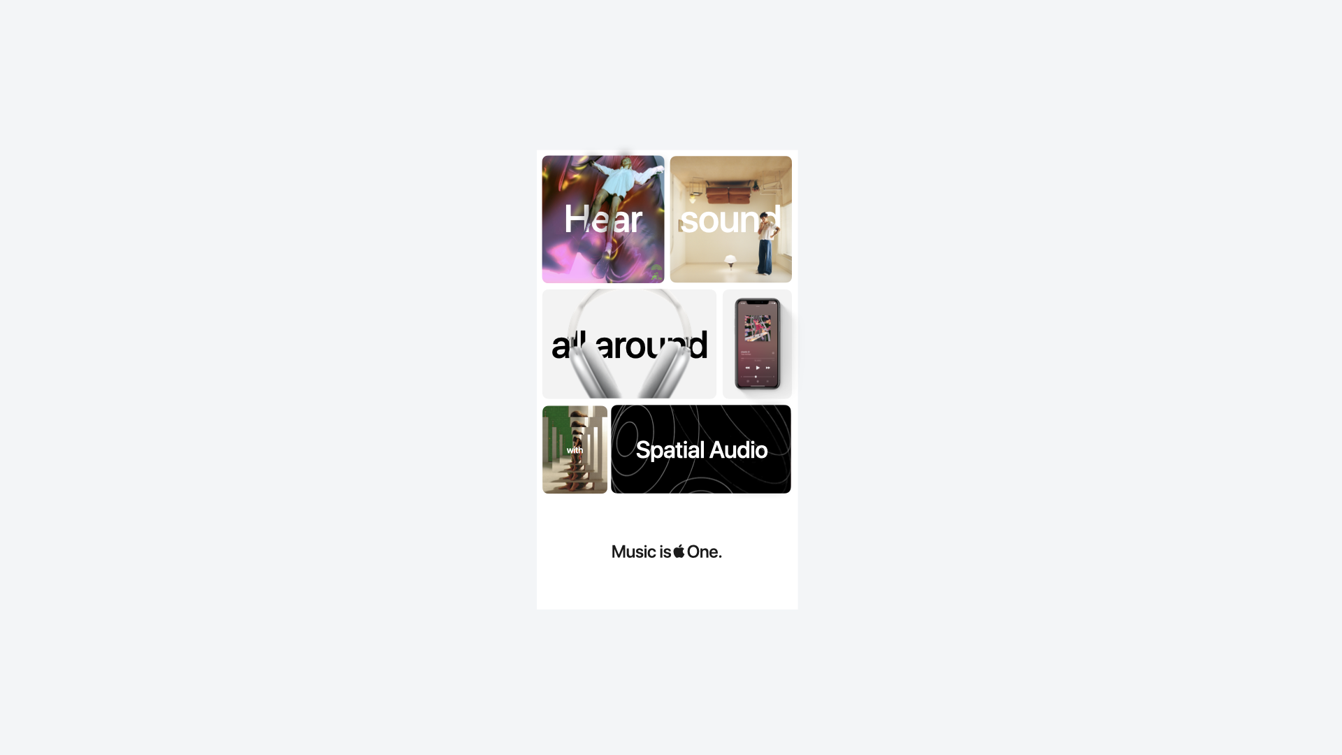
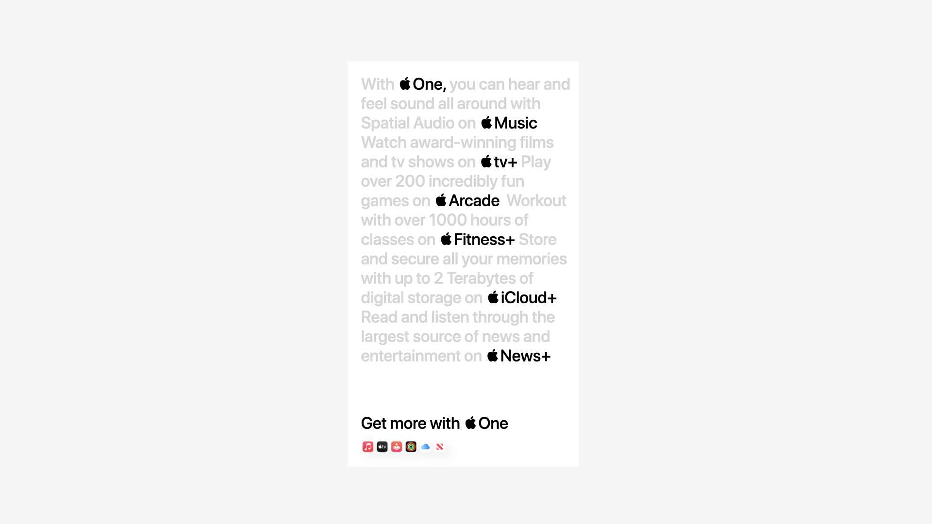
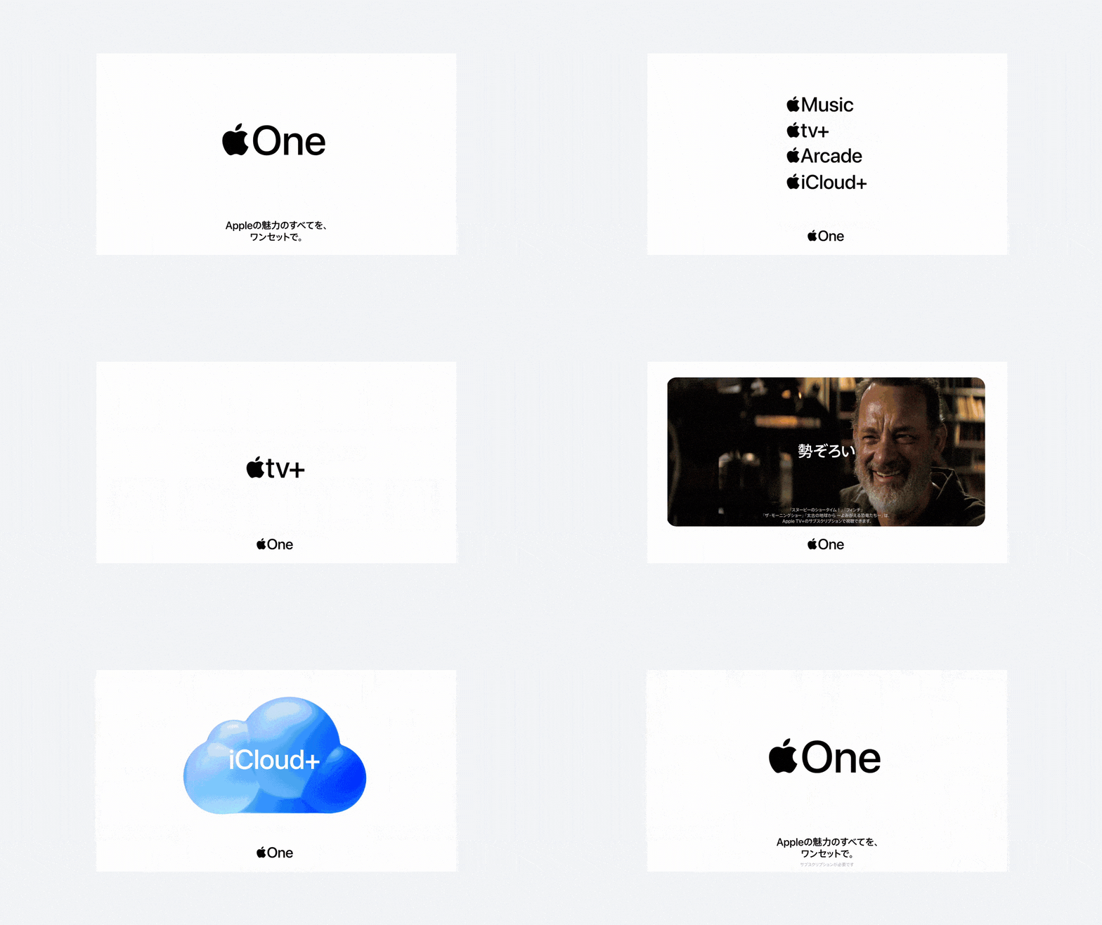
We crafted an Apple mnemonic logo for US & UK, and a custom logo for Japan, which only featured four out of the six services offered. And we created a universal, and timeless design system. With digital out of home from New York City to Tokyo.
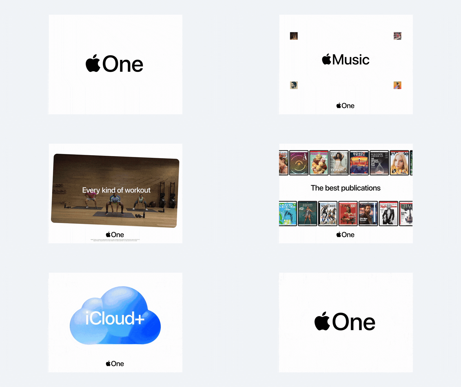
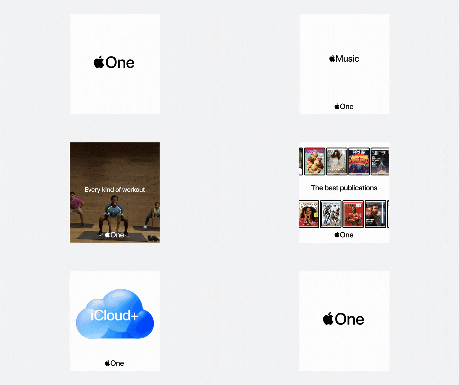
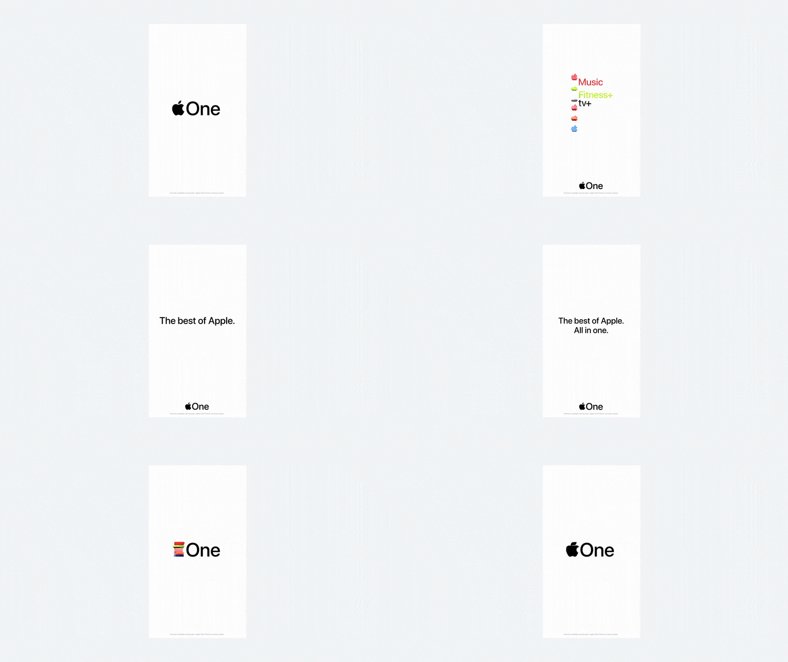
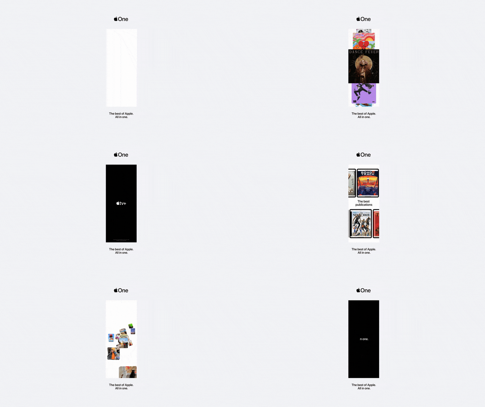
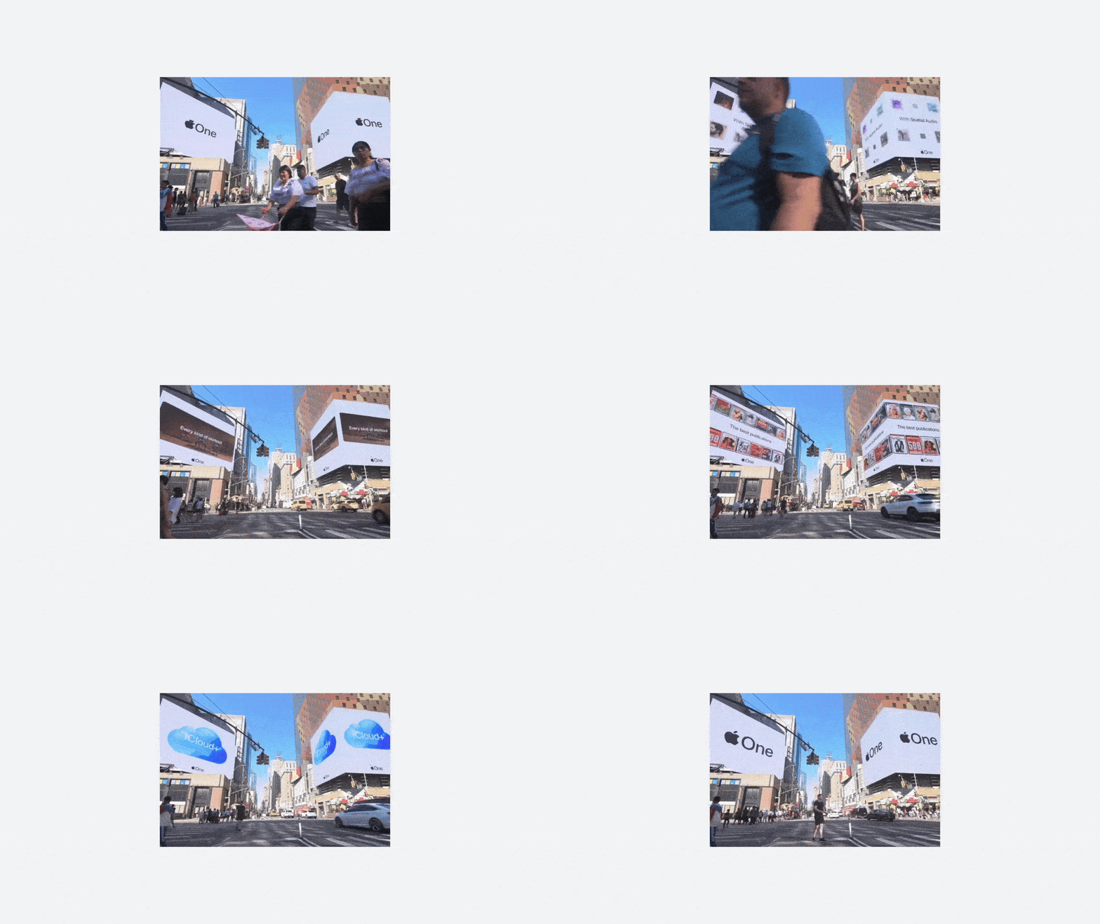
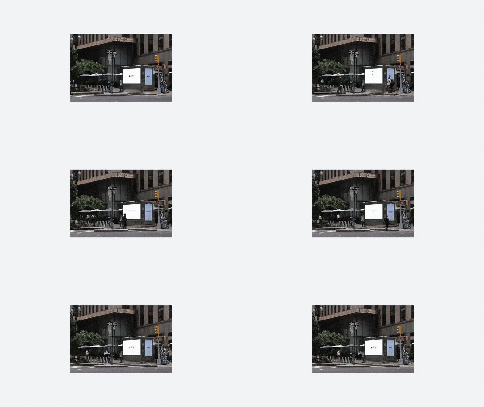
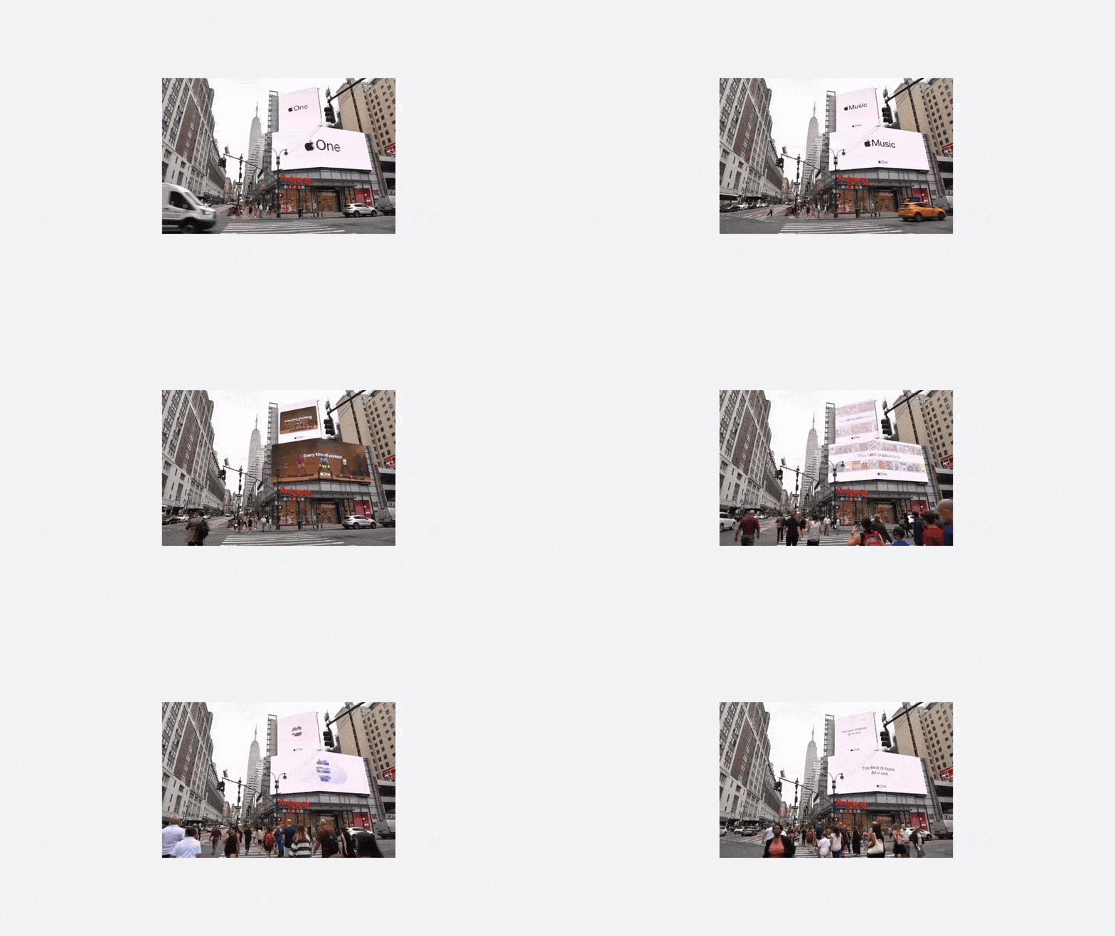
Fig. 04 — :15 Digital Out of Home. US & UK, and Japan. We created a design system that flexed in different aspect ratios. The final production through Media Monks.
![]()
![]()
![]()
![]()
![]()
![]()
![]()
![]()
2021-2022
DESIGN LEAD, ART DIRECTION,
MOTION DESIGN
VISUAL IDENTITY,
RELAUNCH CAMPAIGN
Fig. 05 — Display Ads.
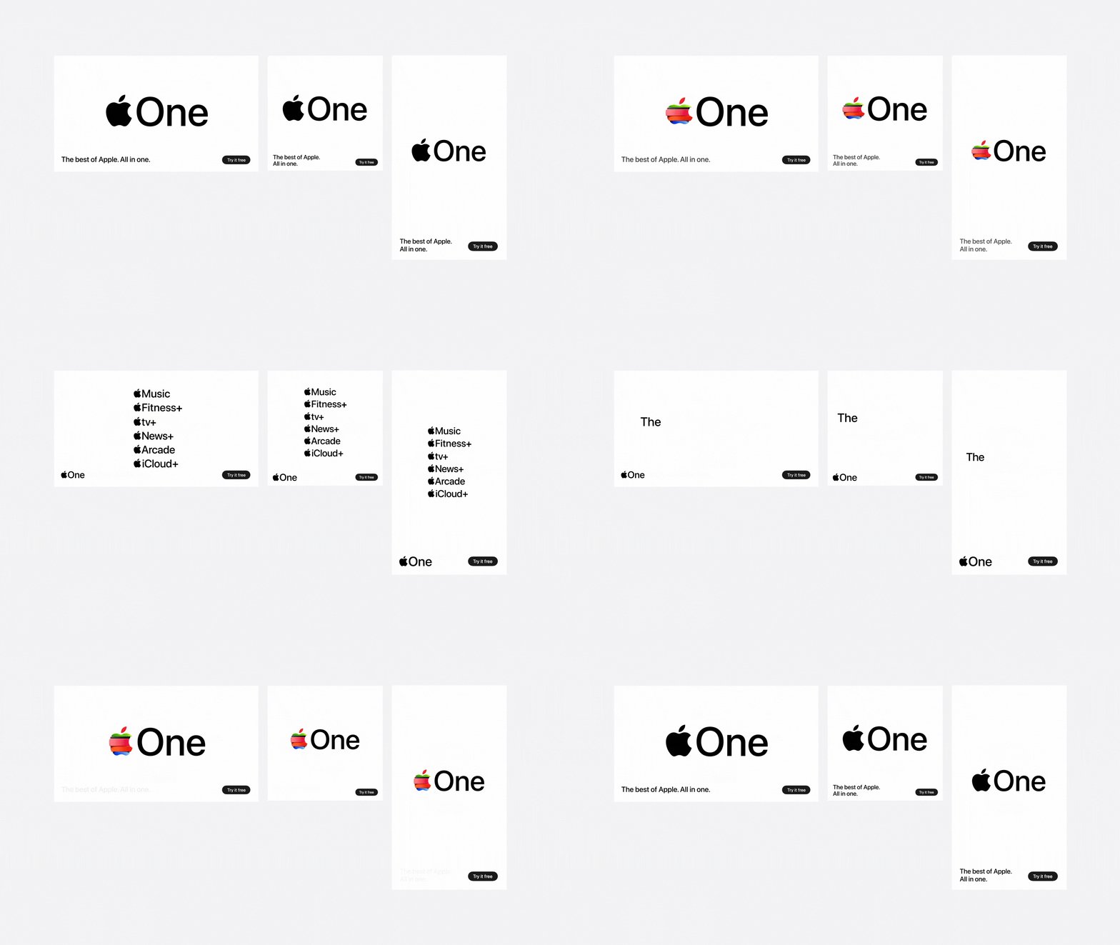
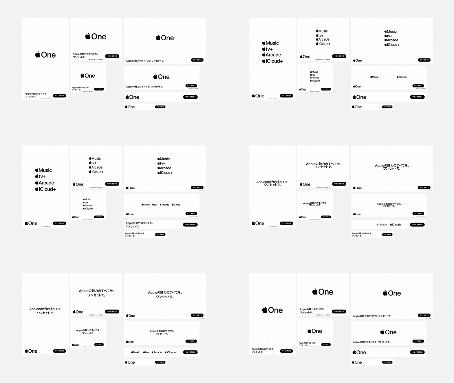
In addition to digital out of home, and display ads, we worked with other creative teams to create :15, and :30 second spots based on our Apple One visual identity, and design system. Collaborated with 3D studio ManvsMachine, and production studio Media Monks.
Fig. 06 — :30 and :15 TV spots.

CREDITS
TEAM
CROSS-FUNCTIONAL TEAMS
3D & MOTION STUDIO
PRODUCTION
TEAM
CROSS-FUNCTIONAL TEAMS
3D & MOTION STUDIO
PRODUCTION
APPLE MARCOM LA DESIGN STUDIO
CREATIVE, APPLE TV+, APPLE MUSIC, APPLE ARCADE, APPLE FITNESS+, APPLE NEWS+, iCLOUD, MARKETING, MUSIC, BA / LEGAL, PHOTO, STRATEGY, MOTION, DIGITAL MARKETING, UK, AND JAPAN
MANVSMACHINE
MEDIA MONKS